Dossier – Dürre und Starkregen
Zwei Seiten einer Medaille: Dürre und Starkregen Viele sehen Design als reine Verschönerung am Ende. Als das i-Tüpfelchen. Doch Design wirkt am stärksten, wenn es von Beginn an mitgedacht wird. Oft herrscht strikte Trennung: Hier der Inhalt (Wissenschaft), dort die Verpackung (Design). Dazwischen: viel Abstimmungsbedarf.In diesem Projekt haben wir die Grenzen aufgeweicht. Mit meinem fachlichen […]
IGB | Charts and Maps
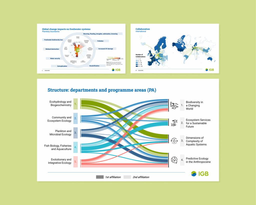
In preparation for the evaluation new IGB-visuals needed to be developed. A coherent and professional style in combination with high adabtability for future uses was essential.
Use Case: Presentations, Posters, Websites, Reports
The work included charts, as well as complex infographics and maps.
Kritische Zukunftsforschung
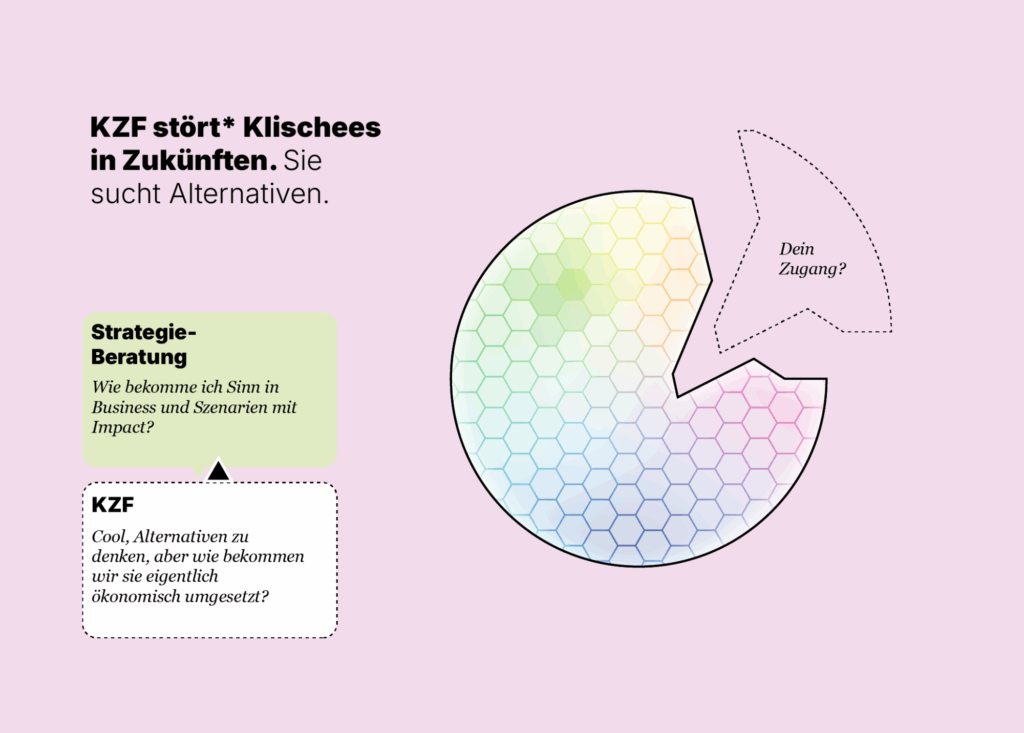
Kritische ZUKUNFTSForschung In diesem Projekt unterstützte ich das Forschungsnetzwerk Kritische Zukunftsforschung bei der visuellen Aufbereitung zentraler Themen: die Dekonstruktion bestehender Zukunftsbilder, die Rekonstruktion alternativer Perspektiven und die Frage nach der realutopischen Wirksamkeit solcher Alternativen. Die Gestaltung macht sichtbar, wie vielfältig Zukunft gedacht werden kann – und wo sich diese Perspektiven mit anderen Forschungsfeldern überschneiden, etwa […]
IGB | Informative Illustrations
Once the concept is approved, I illustrate in vector format (usually in Adobe Illustrator). The result: a tailor-made visual that informs, engages, and supports your communication goals—whether for presentations, reports, websites, or posters.
Article Figures
Making science visible – with clear visuals Creating scientific figures takes more than just data. It takes clarity, structure – and a sense for design. When I support you in developing a visual, it’s not just about making it “pretty.” I bring scientific precision together with a design mindset. So your message becomes visible and […]
Humboldt Uni | Data Justice
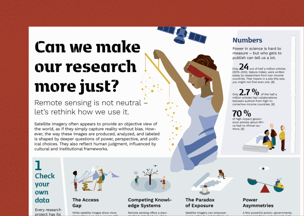
Satellite images may appear objective. but they’re not. Every dataset reflects choices: Who decides what gets measured? Who controls the data? Whose priorities shape the analysis? Justice, diversity, and inclusion in science aren’t optional extras. They are essential foundations if we want research that leads to fairer, more meaningful outcomes.Researchers like PhD Lasse Harkort and Prof. Mia Bennett are […]
Food for Biodiversity
Wie können wir Biodiversität beim Einkauf besser schützen? Für eine Kampagne von Food for Biodiversity habe ich im Rahmen meiner Arbeit bei sustentio GmbH Illustrationen erstellt, diese wurden im Video und auf der Website verwendet. Hier einige Beispiele: Zum Video Hier entlang zur Kampagne von Food for Biodiversity Hier klicken